
The Decision Filter: A Framework to Choose Materials Fast
DECEMBER 01, 2025
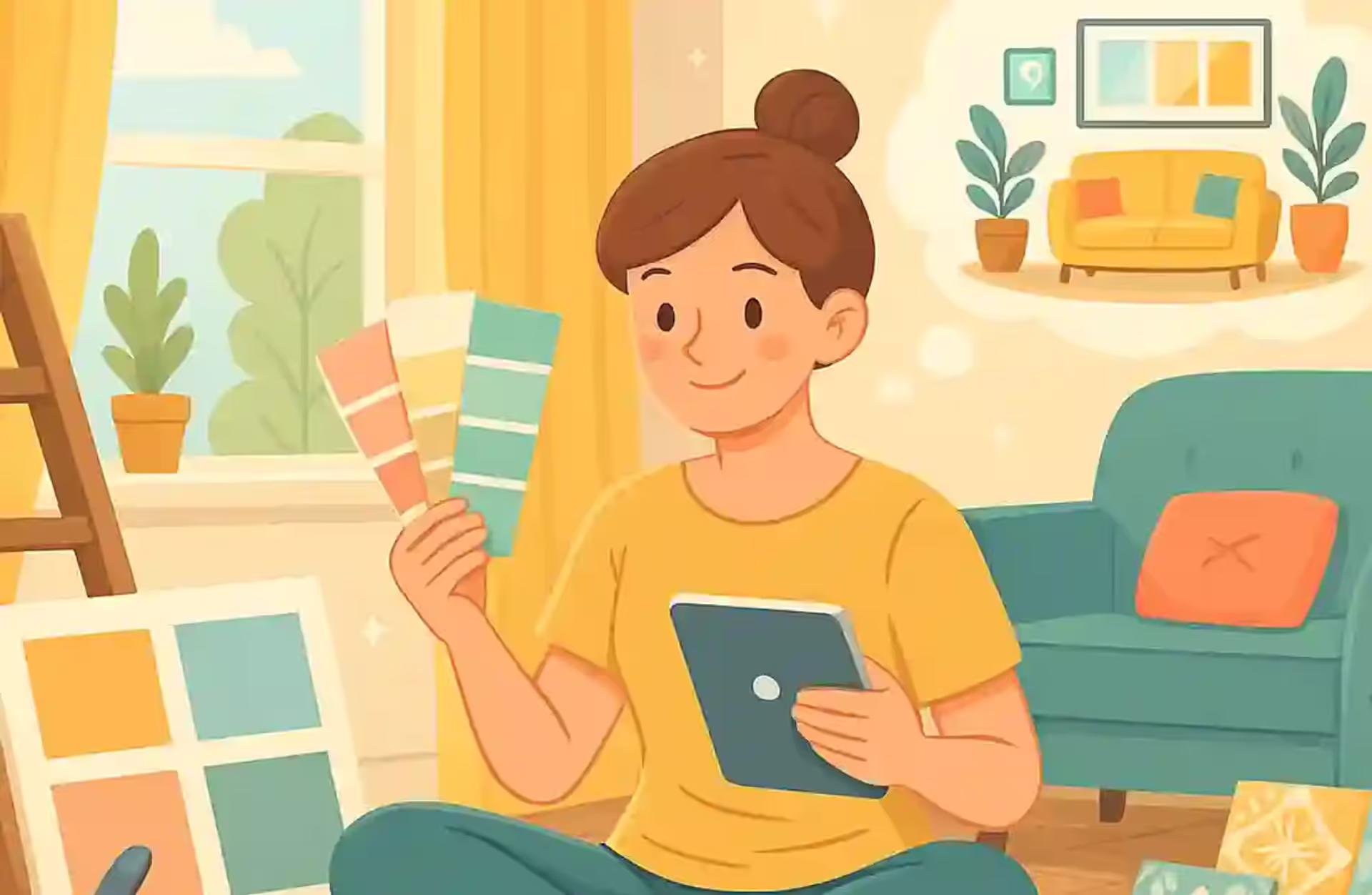
When homeowners embark on a home remodel, their minds race toward the tangible elements: the sleek new cabinets, the hardwood flooring, the granite countertops that promise to anchor the kitchen for decades. Yet amidst the excitement of structural upgrades and material selections, one of the most powerful design elements often receives surprisingly little deliberation—the color palette. This oversight is both understandable and costly, because color does far more than decorate a room. It shapes how you feel the moment you walk through the door, influences your productivity during work-from-home hours, and even affects how well you sleep at night.
Research from environmental psychology confirms what interior designers have long intuited: the hues surrounding us exert a measurable influence on our emotional states, cognitive performance, and physiological responses. According to studies referenced by the American Psychological Association, environmental factors including color significantly impact psychological well-being and daily functioning. This means that your paint color selection during a home improvement project carries implications far beyond mere aesthetics—it's fundamentally about how you'll experience your living space for years to come.
The challenge compounds when you consider that color regret is remarkably common. Homeowners frequently choose hues based on fleeting trends, inadequate lighting tests, or simple impulse, only to find themselves repainting within a year or two. This guide aims to transform your approach to design planning by grounding your color decisions in psychological science, practical testing methodologies, and a long-term perspective that prioritizes emotional durability over momentary appeal. Whether you're undertaking a complete home upgrade or simply refreshing a single room, understanding how color affects mood in home design will prove invaluable.
The relationship between color and human emotion is not merely anecdotal—it's rooted in both evolutionary biology and learned cultural associations. Our ancestors developed instinctive responses to environmental colors that signaled safety, danger, food sources, and shelter. Blue skies indicated fair weather; green vegetation suggested fertile land and water proximity; red fruits promised nutrition. These primal connections persist in our modern responses to interior hues, even when we're far removed from survival concerns.
According to color psychology research from Sherwin-Williams, different hues trigger distinct emotional and physiological responses. Understanding these patterns is essential for anyone planning a home improvement project, because the colors you choose will influence your daily experience in ways both subtle and profound. The science of how color affects mood in home design has advanced considerably, offering homeowners evidence-based guidance that was unavailable to previous generations.
Blue and green occupy a special place in the color psychology hierarchy due to their universal associations with nature's most restorative elements—sky, water, and vegetation. Research published in the National Institutes of Health database demonstrates that interior color significantly affects residential satisfaction and psychological functioning. Blue tones, in particular, have been shown to reduce heart rate and lower blood pressure, making them exceptional choices for bedrooms, bathrooms, and any space dedicated to rest and recovery.
Green carries its own therapeutic properties, connecting inhabitants to the natural world even within urban environments. Studies indicate that exposure to green environments reduces stress hormones and improves mental clarity. Within home design, sage greens, muted teals, and soft aquamarine create spaces that feel simultaneously grounded and refreshing. These colors work particularly well in home offices where sustained focus is required, as they promote concentration without the overstimulation that warmer hues can provoke.
Neutrals have evolved far beyond the beige monotony of decades past. Today's warm neutrals encompass a sophisticated spectrum of taupes, creams, greiges, and off-whites that provide the visual backbone for cohesive interior design. According to the National Association of Home Builders, neutral palettes remain consistently popular among home buyers, making them a strategically sound choice for homeowners concerned with resale value alongside personal satisfaction.
The psychological appeal of warm neutrals lies in their ability to create sanctuary without demanding attention. These colors provide visual rest, allowing furniture, artwork, and architectural details to occupy center stage. In large open-concept spaces—increasingly common in modern home upgrades—warm neutrals create continuity and flow, preventing the visual fragmentation that can occur when each zone demands its own bold statement. They also serve as exceptional canvases for seasonal decor changes, allowing homeowners to refresh their spaces through accessories rather than expensive repaints.
While calming hues and sophisticated neutrals form the foundation of most successful palettes, bold colors have their essential role—when deployed with intention and restraint. Mustard yellows, cobalt blues, oxblood reds, and deep teals can transform a space from pleasant to memorable, adding personality and visual interest that neutral foundations alone cannot achieve. The key lies in strategic application: accent walls, interior doors, built-in cabinetry, or statement furniture rather than wall-to-wall saturation.
The Pantone Color Institute tracks color trends across industries, offering insights into which bold hues possess staying power versus those likely to feel dated within a few years. When planning a home remodel, consulting such resources can help distinguish between timeless statement colors and fleeting fashions. Remember that bold colors in interior design function like spice in cooking—essential for depth and interest, but overpowering when used without measure.
The difference between a palette you'll love for decades and one you'll regret within months often comes down to process rather than taste. Successful color selection requires systematic testing, lifestyle assessment, and a willingness to slow down before committing to gallons of paint. These home remodeling tips for color selection will transform your approach from reactive to strategic, dramatically increasing your chances of lasting satisfaction.
Light fundamentally transforms color perception. A paint that appears as sophisticated greige under showroom fluorescents might reveal pink undertones in your south-facing living room's afternoon sun or seem dingy gray in a north-facing bedroom's perpetual cool light. According to guidance from the Illuminating Engineering Society, both natural and artificial lighting significantly impact color appearance, making comprehensive testing essential before any home improvement commitment.
North-facing rooms receive consistent but cool, indirect light throughout the day. These spaces often benefit from warmer colors that compensate for the blue-gray quality of their illumination. South-facing rooms receive warm, intense light that can amplify yellow undertones and make cool colors appear more vibrant. East-facing rooms enjoy warm morning light that shifts to cooler tones by afternoon, while west-facing spaces experience the reverse progression. Understanding your room's orientation is fundamental to how to choose paint colors for a remodel that will satisfy across all lighting conditions.
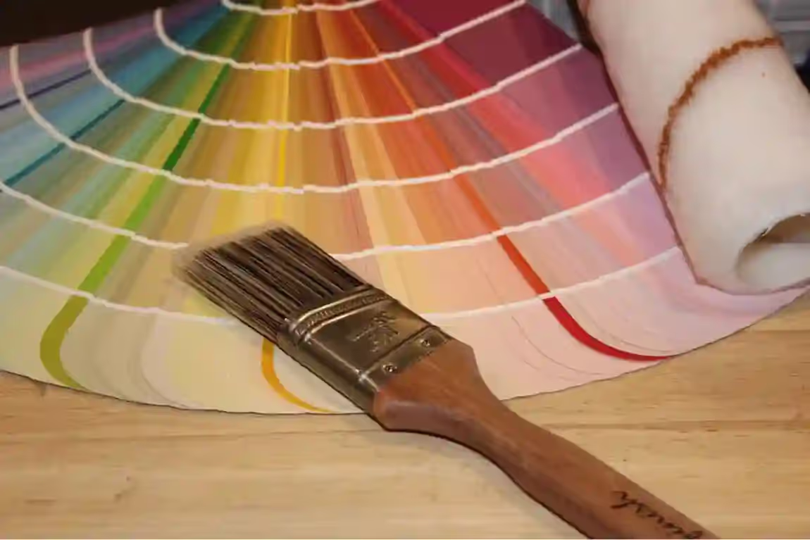
The testing protocol is straightforward but requires patience: purchase sample pots and apply large swatches—at least twelve inches square—on multiple walls in each room under consideration. Observe these swatches at different times: early morning, high noon, late afternoon, and under artificial evening lighting. Note how the color shifts and whether those shifts feel acceptable. Many homeowners rush this step, only to discover that their carefully selected color becomes something entirely different under the lighting conditions that dominate their daily experience.

Color selection should extend beyond aesthetic preference to encompass lifestyle alignment. Before committing to any palette during your home upgrade, engage in honest self-assessment: Do you crave a calming home that serves as retreat from external stimulation, or do you thrive in energized environments that spark creativity and activity? Will this color still feel right in five years when your children have grown, your career has evolved, or your priorities have shifted? How does this palette connect to your daily routines—the morning coffee ritual, the evening unwinding, the weekend gatherings?
These questions matter because homes are not static stages but dynamic environments that must accommodate changing needs. A home office that energizes a solo entrepreneur might overwhelm someone who transitions to a role requiring frequent video calls with clients expecting professional backdrops. A bold dining room that impresses during infrequent dinner parties might exhaust residents who use the space daily for family meals. Color psychology in home improvement extends beyond initial impact to encompass ongoing compatibility with your actual patterns of living.
The design industry cycles through color trends with increasing velocity, propelled by social media's appetite for novelty and manufacturers' commercial interest in encouraging frequent updates. While staying aware of trends has value—particularly for resale considerations—allowing trends to drive major color decisions typically produces regret. That viral millennial pink or sage green of the moment may feel dated remarkably quickly, while the classic navy or warm white you dismissed as boring will continue to satisfy.
Emotional durability in color selection means choosing hues that connect to your genuine preferences rather than current fashions, that complement rather than compete with your existing possessions, and that create the psychological atmosphere you need daily rather than the one that photographs well. This approach to design planning produces spaces that feel personally meaningful rather than generically stylish—and that meaning translates to lasting satisfaction with your home remodel investment.
If color selection has a secret saboteur, it's the undertone—that subtle secondary hue lurking beneath a paint's apparent color. Understanding undertones represents perhaps the most critical home remodeling tip for avoiding color regret, because undertone mismatches cause more dissatisfaction than any other color-related factor. That perfect gray you selected may reveal purple undertones once applied; the warm white you loved at the store might turn unexpectedly pink on your walls; the taupe you chose for its neutrality could clash inexplicably with your cabinetry's yellow-based wood tones.
According to color science resources from Benjamin Moore, every color except pure primary hues contains undertones that emerge differently depending on lighting conditions and surrounding colors. Warm undertones lean toward yellow, orange, or red; cool undertones tend toward blue, green, or purple. Neutral undertones balance warm and cool components, though truly neutral colors remain relatively rare.
The distinction between cool grays and warm grays exemplifies undertone's practical impact. Cool grays contain blue or purple undertones that can feel modern and sophisticated but may also read as cold or sterile, particularly in north-facing rooms or spaces with limited natural light. Warm grays contain brown, beige, or taupe undertones that create cozier atmospheres but may clash with cool-toned flooring or fixtures. Neither is inherently superior; the question is which aligns with your space's existing elements and desired mood.
White paint presents undertone challenges that surprise many homeowners. Yellow-based whites create warmth and softness but may appear dingy beside true white trim or in spaces with cool northern light. Blue-based whites feel crisp and clean but can seem cold or clinical in spaces lacking warm natural light. Green undertones in white paint can look fresh and organic or make a room feel oddly institutional depending on context. When selecting white for your home improvement project, comparing multiple options side-by-side against a piece of pure white printer paper reveals undertones that might otherwise remain hidden until after application.
Beige and greige (gray-beige) colors present similar complexity. Pink-beige undertones create warmth but may clash with green-beige elements already present in flooring or cabinetry. Green-beige undertones feel organic and sophisticated but require coordination with other elements sharing that green base. The Sherwin-Williams undertone guide provides detailed methodology for identifying and coordinating undertones, an essential resource for anyone serious about color psychology in home improvement.
Beyond emotional impact, color serves as a powerful tool for manipulating spatial perception—making rooms feel larger or smaller, ceilings higher or lower, spaces more intimate or more expansive. Professional designers have long exploited these effects to address architectural limitations, and understanding these principles allows homeowners to achieve similar transformations during their home remodel without the expense of structural modification.
Light colors expand perceived space by reflecting more light and creating a sense of openness and airiness. Small rooms painted in pale blues, soft whites, or light grays appear noticeably larger than their actual dimensions suggest. This effect intensifies when the same light color continues across walls and ceiling, eliminating visual boundaries that define and constrain the perceived space. For cramped bathrooms, narrow hallways, or compact bedrooms, light palette choices during your home upgrade deliver significant spatial dividends.
Dark colors produce the opposite effect—absorbing light and creating intimacy, drama, and visual weight. While this might suggest avoiding dark colors in small spaces, the reality is more nuanced. A small room painted in deep navy or charcoal can feel surprisingly sophisticated and cozy rather than cramped, provided lighting is adequate and furnishings are appropriately scaled. Dark colors excel in spaces where intimacy is desirable: home theaters, wine cellars, libraries, primary bedrooms intended as retreats from external stimulation.
Each room in a home serves distinct purposes that suggest optimal color approaches. While personal preference ultimately governs individual choices, color psychology offers evidence-based starting points for room-specific decisions. Understanding how color affects mood in home design allows homeowners to align their palette choices with each space's intended function, creating environments that actively support rather than subtly undermine daily activities.
According to research compiled by the Environmental Design Research Association, the relationship between environmental color and human behavior varies significantly by context and intended activity. Spaces designed for relaxation benefit from different color treatments than those intended for productive work or social gathering. This functional approach to color selection represents a cornerstone of effective design planning.
Best Colors for Bedrooms The bedroom's primary function—restorative sleep—suggests color choices that promote relaxation and prepare the mind for rest. Soft blues in particular have demonstrated sleep-enhancing properties, with research suggesting that people in blue bedrooms tend to sleep longer and wake feeling more refreshed than those in rooms painted other colors. Muted greens offer similar benefits, connecting sleepers to nature's calming influence even in urban environments. Warm neutrals create cocoon-like comfort without the stimulation that bolder colors might provoke.
Colors to approach with caution in bedrooms include stimulating reds and oranges, which can elevate heart rate and interfere with the wind-down process, and stark whites, which may feel clinical rather than restful. If you prefer warmer tones in your sleeping space, consider muted versions—dusty rose rather than hot pink, terracotta rather than bright orange, soft gold rather than vivid yellow. The best paint colors for home upgrade projects in bedrooms prioritize serenity over statement.
The psychology of bedroom color extends beyond initial preference to encompass how colors affect your circadian rhythms and sleep quality. Blue light, for instance, suppresses melatonin production—which is why experts recommend avoiding blue-lit screens before bed. While this primarily concerns artificial light sources, very cool blue walls might subconsciously signal alertness. Warmer, muted variations of blue sidestep this concern while retaining the calming properties that make blue such an effective bedroom choice. Similarly, green's association with nature and growth creates psychological comfort without the potential sleep-disrupting effects of more stimulating hues.
Best Colors for Living Rooms Living rooms typically serve multiple functions—entertaining, relaxing, family gathering, possibly even working—making versatile neutrals particularly appropriate. Warm grays, soft beiges, and creamy whites provide backgrounds that accommodate changing furniture arrangements, seasonal decor updates, and the varied activities these spaces host. These colors also offer broad appeal for homes that may eventually sell, addressing both personal satisfaction and resale considerations during your home improvement planning.
For homeowners who find pure neutrals understimulating, consider saturated neutrals that deliver more visual interest while maintaining versatility—deep taupes, rich grays with subtle warm undertones, or sophisticated putty tones that exist between beige and gray. These colors create sophisticated backdrops that allow furnishings and art to command attention while contributing their own subtle character to the space.
Best Colors for Kitchens Kitchens have evolved from purely functional spaces to social hubs and design showcases, their color requirements shifting accordingly. Crisp whites remain perpetually popular for their ability to reflect light, create clean backdrops for colorful food and dishware, and coordinate with stainless steel appliances. Sage greens have emerged as sophisticated alternatives, adding warmth and organic appeal without overwhelming the space's practical functions. Charcoal accents provide modern edge, particularly effective on lower cabinets or island bases where they ground the space while upper areas remain light and airy.
Consider also the psychological aspects of eating and food preparation when selecting kitchen colors. While red stimulates appetite and has long been associated with restaurant design, it can feel overwhelming as a dominant kitchen color in residential settings. Instead, incorporate warm accents through accessories, pendant lights, or small appliances that can be changed as preferences evolve. Yellows in kitchens create cheerful morning atmospheres but should lean toward buttery or golden rather than bright primary yellow, which can become fatiguing during extended time in the space.
Best Colors for Home Offices With remote work becoming permanent for many professionals, home office color selection has gained importance in the home remodel conversation. Greens support sustained focus by reducing eye strain and creating calm environments conducive to extended concentration. Muted blues promote calm productivity without the drowsiness that deeper blues might induce. Warm whites prevent the sterility of pure whites while maintaining the brightness that promotes alertness and energy.
Best Colors for Bathrooms Bathrooms benefit from colors that evoke spa-like serenity while addressing practical concerns about moisture, limited natural light, and the need for easy maintenance. Serene aquas and soft teals connect to water imagery while creating restful atmospheres. Spa-like neutrals—soft grays, warm taupes, creamy whites—provide sophisticated backdrops that don't compete with the room's fixtures and finishes. Light colors generally work best in bathrooms, reflecting available light and creating the sense of cleanliness that these spaces require.
Individual room color success means little if the overall home lacks coherence. The challenge of building a whole-home palette lies in balancing variety—each space needs its own character—with unity that creates flow and intentional design. This balance represents one of the most sophisticated aspects of design planning, requiring consideration of sightlines, transitions, and the cumulative experience of moving through your home.
Start with a dominant base color that appears throughout the home, typically a neutral that connects spaces without demanding attention. This might be the trim color that frames every room, a hallway shade that links separate areas, or a recurring wall color in transitional spaces. From this foundation, choose two to three complementary accent shades that appear strategically throughout—perhaps a blue that shows up in both the primary bedroom and the living room accessories, or a green that connects the kitchen to the home office.
This systematic approach to whole-home color represents a cornerstone of successful home remodel strategy, ensuring that individual room decisions contribute to an aesthetically unified result rather than a disjointed collection of unrelated spaces.
Color selection extends beyond hue to encompass finish—the paint's sheen level that affects both appearance and performance. According to resources from Benjamin Moore's paint finish guide, finish choice impacts durability, cleanability, how colors read in different lights, and the overall mood a room conveys. Understanding finish options is essential for anyone serious about color psychology in home improvement.
Matte and Flat Finishes: These no-sheen options excel at hiding surface imperfections—bumps, patches, and minor irregularities disappear under their light-absorbing surfaces. Matte creates sophisticated, modern atmospheres and works beautifully on ceilings and in low-traffic spaces like formal living rooms and adult bedrooms. However, matte finishes clean less easily and may show marks from frequent touching, making them problematic in high-traffic areas or spaces used by children.
Eggshell Finish: Named for its resemblance to an actual egg's subtle sheen, this versatile finish balances aesthetics with practicality. Eggshell reflects slightly more light than matte, adding gentle warmth while remaining forgiving of wall imperfections. It cleans more easily than flat finishes, making it appropriate for most living spaces. As noted in guidance from Home Depot's paint resources, eggshell represents the most popular choice for interior walls, offering a middle ground that serves most homeowners' needs during home improvement projects.
Satin Finish: Satin delivers noticeably more sheen than eggshell while remaining less reflective than semi-gloss. This finish provides excellent durability and stain resistance, cleaning easily even when subjected to frequent touching. According to guidance from Lowe's paint selection resources, satin works particularly well in high-traffic areas like hallways, kitchens, and bathrooms where walls endure regular contact and occasional scrubbing. The increased sheen adds richness to colors and reflects light pleasantly, though it also reveals surface imperfections more readily than lower-sheen options.
Semi-Gloss Finish: Semi-gloss provides significant light reflection and exceptional durability, making it ideal for trim, doors, and woodwork that requires frequent cleaning. This finish highlights architectural details beautifully, its reflective surface catching light and adding dimension to moldings, window frames, and baseboards. While semi-gloss can be used on walls in moisture-prone areas like bathrooms, its high sheen reveals every surface imperfection, requiring meticulous wall preparation.
High-Gloss Finish: The most reflective option, high-gloss creates dramatic, almost lacquered surfaces that demand perfect underlying walls. This finish works beautifully on interior doors, cabinetry, and statement furniture pieces where its mirror-like quality adds sophistication and visual impact. High-gloss requires the most maintenance—fingerprints and smudges show immediately—but also cleans most easily and provides the most durable protection against moisture and wear.
Learning from others' errors accelerates your own success. After years of helping homeowners navigate color decisions, design professionals have identified recurring mistakes that lead to dissatisfaction and costly repaints. Avoiding these pitfalls represents some of the most valuable home remodeling tips available—prevention being far less expensive than correction.
Picking colors too quickly: The excitement of a home remodel can drive rushed decisions that homeowners regret once living with the results. A color that looks perfect on a two-inch swatch often reads entirely differently across four walls of a bedroom. Taking time to test, observe under varied lighting, and sit with choices before committing prevents the expense and hassle of early repainting.
Ignoring undertones: As discussed earlier, undertone mismatches cause more color regret than any other factor. That perfect gray that reveals purple undertones, or the warm white that turns pink—these surprises could be avoided through careful undertone analysis and comparison testing before purchase.
Choosing based on trends alone: Social media accelerates trend cycles to unsustainable speeds. The color that dominates design feeds this season may feel dated remarkably quickly. While trend awareness has value, allowing trends to override personal preference and timeless sensibility produces spaces that satisfy briefly rather than enduringly.
Avoiding neutrals out of fear of being boring: Some homeowners overcorrect toward bold colors, mistaking neutral palettes for lack of creativity. In reality, sophisticated neutrals provide the foundation for layered, evolving design while allowing bold expression through furnishings, art, and accessories that can change without repainting.
Not testing samples on different walls: A single test swatch on one wall provides incomplete information. Colors appear different on walls facing windows versus those opposite; they shift near wood floors versus tile; they read differently beside white trim versus stained wood. Testing on multiple surfaces throughout the room reveals how the color will actually perform in your space.
Forgetting about existing fixed elements: Your wall color must coordinate with elements you're not changing—flooring, countertops, tile, cabinetry hardware. A color that looks perfect in isolation may clash terribly with the warm oak floors or cool gray countertops you're keeping. Consider these fixed elements as non-negotiable members of your palette that new colors must complement.
The investment you make in thoughtful color selection pays dividends that extend far beyond aesthetic satisfaction. Colors that align with your psychological needs, complement your existing elements, and reflect genuine rather than trend-driven preferences create homes that feel right day after day, year after year. This is the essence of color psychology in home improvement—using scientific understanding of human response to color to create environments that actively enhance your quality of life.
Consider the cumulative impact of color decisions across your daily experience. You wake in a bedroom whose colors support restful sleep and pleasant awakening. You prepare for the day in a bathroom whose palette feels clean and restorative. You work in a home office whose hues promote focus without fatigue. You gather with family in living and dining spaces whose colors facilitate connection and comfort. You wind down in spaces designed to ease the transition from activity to rest. When every color choice has been made with intention and understanding, your home becomes a powerful ally in living well.
Color selection during a home remodel represents one of those rare opportunities where informed decision-making produces dramatic improvement in outcomes with minimal additional investment. The paint costs the same regardless of which color you choose; the difference lies entirely in the thought and testing you invest before application. By grounding your choices in color psychology principles, testing rigorously under varied conditions, considering undertones and existing elements, and prioritizing emotional durability over trend compliance, you position yourself for lasting satisfaction with your home improvement investment.
The best paint colors for home upgrade projects are ultimately those that serve your actual life rather than an imagined ideal. They're colors you tested thoroughly rather than selected impulsively. They're hues that complement your fixed elements rather than competing with them. They're palettes that support the activities each space hosts rather than undermining them. And they're choices made with enough understanding of color psychology to anticipate how you'll feel living with them—not just how they'll look in the first photographs you take.
Your home's color palette is too important to approach casually. It shapes your emotional landscape, influences your daily functioning, and significantly impacts your home's value and appeal. By treating color selection as the consequential decision it truly is—engaging with the psychology behind different hues, testing thoroughly before committing, and choosing for longevity rather than momentary trend compliance—you create the foundation for a home that delights rather than disappoints, that energizes rather than exhausts, and that continues to feel right long after the paint has dried.
The journey from color confusion to confident selection requires patience, but the destination justifies every moment invested. Those who rush through color decisions often find themselves repainting within a year or two, having spent not only the cost of materials and labor twice but also endured months of living with choices that felt wrong. Those who invest in proper selection—testing samples, understanding undertones, considering lighting conditions, matching colors to room functions—enjoy their spaces fully from day one and continue enjoying them for years to come.
Remember that professional designers consider color selection among the most important decisions in any home improvement project, not because paint is expensive—it's actually one of the most affordable elements of any renovation—but because it so dramatically affects the final result. The same kitchen with the same cabinets, countertops, and appliances can feel entirely different depending on wall color. The same bedroom can promote restful sleep or restless anxiety based on palette choice. This power to transform experience without structural change makes color selection both critically important and wonderfully accessible to homeowners willing to invest the thought it deserves.
DECEMBER 01, 2025
NOVEMBER 28, 2025
NOVEMBER 28, 2025
NOVEMBER 28, 2025
NOVEMBER 28, 2025